 The Toronto Blue Jays are finally through being cool. After a decade or so of denying the biological realities of their own mascot’s plumage, the Jays have spent this Opening Day weekend showing off their new blue jerseys—which are conveniently also their old blue jerseys. This retro change-up, along with the return of a disturbingly vocal contingent of Canucks to Progressive Field, has The Opposite Field feeling weirdly nostalgic for the golden era of Canadian baseball— back when The Simpsons was fresh, Milli Vanilli were Grammy winners, and Michael Keaton was Batman.
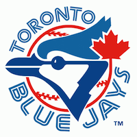
Clearly-- much like their cellar-dwelling division rivals in Baltimore-- the perennially uninteresting Blue Jays have resurrected their old bird logo as a not-so-subliminal visual cue to a long-suffering fan base. “Remember this?!” it says. Marketing groups know that nostalgia is a cash cow right now; just like adding the color black to your uniform was the rule of thumb ten years ago. But if you think the Jays’ return to blue is all about fuzzy memories of Joe Carter and those early ‘90s World Series rings, you’re only halfway right.
I have never personally given a rat’s ass about the Toronto Blue Jays, myself. I’ve never even been to Toronto. And yet, the sight of that old logo managed to flip a happy switch in my subconscious, too. It might seem like unintended, collateral nostalgia damage from the Jays PR point of view, but that’s only if you don’t know how marketing works. The truth is, the current retro uniform trend is pure genius in action. Whether it’s the Washington Wizards/Bullets, the New York Jets, or an ornithological MLB club, turning back the palette a couple decades will always transcend the usual rules of performance-based, aesthetics-based, or even regional-based merchandise sales. Case in point, when the Orioles sell their “new” cap with that fat, smiling bird on it, baseball nerds all over the country will be inclined to buy it—not because Nick friggin’ Markakis is wearing it, but because it’s “Cal Ripken’s old hat!” Or Brooks Robinson’s, for that matter.
Similarly, in the case of my immediate reaction to the new/old Blue Jay duds, it’s not any sort of fandom for the Toronto franchise that springs to mind—it’s random memories of pre-cable Indians games on WUAB, squaring off against the likes of George Bell, Dave Stieb, and to a lesser but more peculiar extent, Lloyd Moseby. And on the other side of that prism is carefree, childhood bliss.
 If you don’t remember Lloyd Moseby, you likely don’t remember ALF, Real Genius, or Tecmo Bowl, either. Lloyd was a first round pick of the fledgling Blue Jays in 1978, and wound up being their center fielder for basically the entire decade of the 1980s. He was only a .257 career hitter, but he could steal you 30 bases and hit you 20 bombs, so he was no slouch. That said, it was not Moseby’s on-field production that left a mark on me as a kiddo. In a way, you could say it was his modeling work.
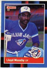
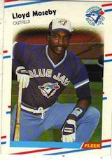
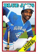
Back in 1988, during the height of my baseball card collecting days (a hobby which proved to be a colossal waste of time from a financial standpoint), I declared no special allegiance to one card-making company over another. I recall knowing even then that Donruss sucked, but nonetheless, my collection included plenty of those shitty Diamond Kings cartoons in amongst the Topps, Score, and Fleer piles. And it was out of this jumble of competing card manufacturers that the greatness of the Blue Jays’ Lloyd Moseby first caught my eye. You see, in 1988, Lloyd was part of a baseball card phenomenon not unlike the aligning of three planets in the night sky. In a masterstroke of unprecedented consistency, he apparently approached each photo shoot that spring with an identical, almost scientifically precise pose in mind. As a result, Topps, Donruss, and Fleer—three distinct companies with their own art departments-- all wound up with comically identical-looking Lloyd Moseby cards in their respective 1988 sets.
Right knee on ground, left elbow balanced on left knee, right palm resting on the knob of a bat, right elbow pointed skyward at a 45-degree angle.
Why, almost 25 years later, would I remember this useless, quirky factoid about a guy who wasn’t even on either of the Jays’ World Series teams? Well, the truth is, I didn’t really remember it… until I saw those blue jerseys again. I suppose two extra-innings losses in a row give one time for pause. Even if that time could be better spent thinking about a thousand more pressing matters of adulthood.