 Browns Archive
  10 Possible Logos for the Next Browns Helmet
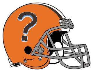 The suffocating disappointments of the past 20 years have left Cleveland Browns fans relatively numb to most things. Another starter blows out his achilles in training camp? “Oh well.” A cartoonish truck-stop tycoon named Jimmy buys the franchise a month before the season starts? “Mmkay.” But when the Browns’ new owner left the door open to changing the team’s famously minimalist uniforms, the fan base was suddenly stirred from its trance. “He wouldn’t put a logo on the helmet, would he?!” we gasped in a collective, hysterical panic. “Not the helmets!” we repeated to no one in particular, collapsing slowly into a fetal position. “Please, not the helmets!”
But yes, folks. It could happen. Just like Chief Wahoo retiring to a gated community for bigoted mascots somewhere in central Florida, the Browns’ beautifully blank, pumpkin-colored lids may soon be replaced with a snazzier, 21st century model. Probably not next year. And most likely not the year after that, either. But as a Knoxville boy from the NASCAR school of logo inundation, Jimmy Haslam III is eventually going to consider every avenue toward better brand recognition, and we’d be wise to prepare for it.
Believe it or not, some people seem to think the current Browns’ uniforms are “ugly” and/or “an abomination,” while others single out the logo-less helmet specifically as being “boring,” “stupid,” and “all orange and stuff.” These are harsh realties that consistently leave Browns merchandise sales behind the competition of silvery, shinier, stripier teams like the Patriots, Broncos, and Eagles.
For a new generation, the blank helmets have come to symbolize not the blue collar spirit of a team-first, no-nonsense, championship football club, but the orange and brownness of a crappy, non-competitive, bottom feeding embarrassment. Those of us who believe in tradition and value uniqueness will continue to defend the pumpkin heads until the end, I suppose. But in the event that a logo is finally forced upon us, the question becomes… what the hell would it be?
Well, people certainly have some ideas where that’s concerned, and the cool thing is, they’re all pretty much equally horrible—making it much easier for us traditionalists to discount every single one of them without hesitation.
Nonetheless, I suppose it’s at least worth seeing what these prospective Browns logos might actually look like. So the idea occurred to me to have a professional graphic designer create realistic mockups of 10 of the leading candidates for the next Cleveland Browns helmet. Then, I realized that doing that would cost money and time. So I just made them myself with a shitty, knockoff design program and five minutes of copying and pasting. Enjoy!
How Low Can You Logo? 10 Design Ideas for the Next Cleveland Browns' Helmet
10. The Traditionalist’s Compromise
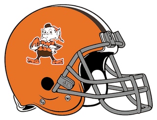
“Okay, if they insist on putting a damn logo on the helmet, why not go with the elf? He was the team’s main logo during the golden era, anyway, bla bla bla.”
9. Counter Argument to the Elf
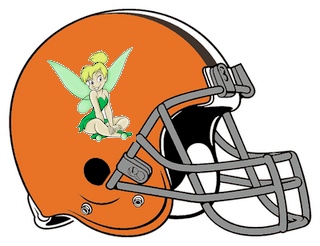
8. Jimmy Haslam’s First Logo Idea
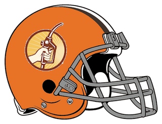
“R’member how the Houston Oilers used to have that oil tower thingy on their helmets? Well, I own Pilot travel centers, where people go and fill up their tanks. Everybody has positive thoughts about gasoline these days, so how ‘bout somethin’ like this?”
7. A Long Overdue Color Change
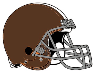
For decades, people have asked the same question: “If they’re called the ‘Browns,’ how come their helmets are orange?” And for decades, we were plain stumped. Maybe Paul Brown knew all the game footage was in black and white and thought nobody would notice? In any case, it’s a problem that Jimmy Haslam is finally going to solve. Meet the new Browns… decked out in head-to-toe, poo-tacular brown!
6. Dawgie
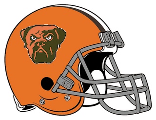
“Marketing research shows the mean dog head logo would go over huge with the all-important ‘suburban middle class white kids who think they’re gangsters’ demographic.”
Honorable Mention: Proper ID
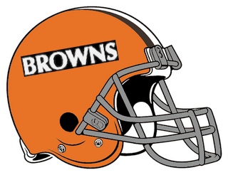
“What’s the team with the orange helmets? … Oh nevermind, it says it right on there. My, that is quite helpful!”
5. Jimmy Haslam’s Next Logo Idea
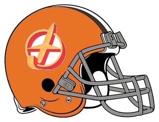
“Yeah, on second thought, how ‘bout we just slap the Flying J logo right on that sucker. Whatdya think?”
4. More Cross-Promotion
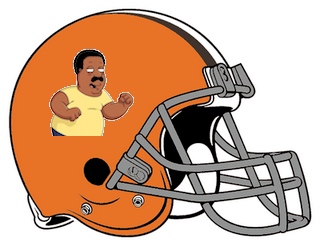
“Fox tends to bury our games against NFC opponents, but that could change in a hurry if we turned out helmets into 3-hour promos for their Sunday night ‘Animation Domination’ line-up.”
3. Hero Worship
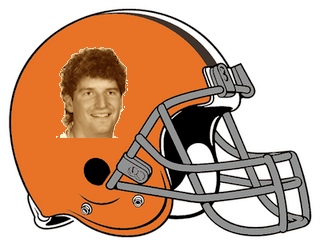
“Now hear me out here, people. …Bernie Kosar’s Chia-Pet head. Need I say more?”
2. Jimmy Haslam’s Final Logo Idea
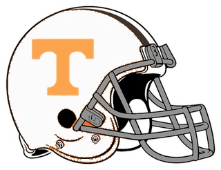
“I know what you’re thinking. Looks kinda familiar, right? Looks a bit like my beloved Tennessee Volunteers’ helmet? Well, I grant you that. But in this case, the big T stands for ‘THE’ Cleveland Browns. …Obviously."
1. And the Best New Logo for the Cleveland Browns Helmet is...
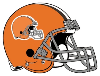
For years, the great paradox of the Browns helmet was that—by not having a logo—the helmet itself BECAME the logo. And that, my friends, is why I have devised the perfect solution for those who believe in the tradition of the orange helmets AND the need for a new logo. I give you… the Browns Helmet Helmet.
.
- NBA Announces 2013-2014 Schedule
- Browns Ink Sharknado
- Sharknado A No-Show For Rookie Camp
- Trent Richardson Out Until Training Camp
- Browns Sign Brandon Jackson
- Carrasco Suspended Eight Games
- Browns Add to Wide Receiver Depth with David Nelson
- Browns Need to Learn from Past Draft Mistakes
- Browns Release Chris Gocong and Usama Young
- Browns Missing on Grimes Disappointing, But Not The End
The TCF Forums
- Movies coming out
rebelwithoutaclue (Tuesday, January 21 2014 12:56 PM) - 2015 Recruiting
jclvd_23 (Tuesday, January 21 2014 12:38 PM) - The 2014 Offseason Thread
Larvell Blanks (Tuesday, January 21 2014 12:25 PM) - Official- Browns Coach Search/Rumors
Larvell Blanks (Tuesday, January 21 2014 11:53 AM) - Chris Grant's first 3 drafts
Kingpin74 (Tuesday, January 21 2014 10:13 AM) - Mike Brown
YahooFanChicago (Monday, January 20 2014 11:15 PM) - 2014 Hoops Hockey Hijinx
jpd1224 (Monday, January 20 2014 4:44 PM) - 2014 Recruiting
jclvd_23 (Monday, January 20 2014 2:26 PM) - Wish List - #4 Pick
Hikohadon (Monday, January 20 2014 1:26 PM) - #1 overall pick Anthony Bennett
TouchEmAllTime (Sunday, January 19 2014 1:28 PM)


