


![]() Since both the Cavaliers and Indians have introduced some conservative and yet oddly controversial uniform and logo adjustments of late, it seems like an opportune time to consider the importance of good branding in sports—or more specifically—the hilarious consequences of crap branding. In Cleveland, our most beloved terrible logo has always been that tempestuous Chippewa off the old block, Chief Wahoo (or “Runs With Stereotype”). But would you believe we’ve managed worse? Observe, the “10 Worst Logos in Cleveland Sports History,” or, “10 More Reasons to Love the Browns’ Helmet.”
Since both the Cavaliers and Indians have introduced some conservative and yet oddly controversial uniform and logo adjustments of late, it seems like an opportune time to consider the importance of good branding in sports—or more specifically—the hilarious consequences of crap branding. In Cleveland, our most beloved terrible logo has always been that tempestuous Chippewa off the old block, Chief Wahoo (or “Runs With Stereotype”). But would you believe we’ve managed worse? Observe, the “10 Worst Logos in Cleveland Sports History,” or, “10 More Reasons to Love the Browns’ Helmet.”
I'm no graphic designer myself, but I do work in marketing, and the general rule of thumb for increasing consumer recognition and appreciation for a product is to deliver it in an aesthetically pleasing and easily memorable package. Ideas that are received with disappointment, horror, or disgust-- such as a football team in brown pants-- would presumably be cast out. But 'round these parts, such rules have never seemingly applied, even where it concerns the very symbols designed to represent an entire brand to the general public. And so let us begin the countdown of Cleveland's logo hall of shame.
![]() #10. That B Inside the Striped Football Thing – Cleveland Browns (2003-Present)
#10. That B Inside the Striped Football Thing – Cleveland Browns (2003-Present)
I’m all for simplicity, especially when we're talking about the Browns, but there’s something about this secondary, clipart-esque emblem that just doesn’t sit well. It’s as if somebody from the NFL offices called Berea one day and demanded an extra logo without all the mysterious subtext and pretentiousness of our usual "cartoon orange helmet" approach. They needed something a tad easier to digest. And so the Browns marketing team was given roughly 30 seconds to come up with something, resulting in the image to the left there. Who’s to say whether they started with the letter B or the football shape. It’s a chicken and egg question we’ll never have the answer to. But once the two ideas merged, the rest was history. Now you’re hard pressed to leave your house without seeing somebody sporting this logo somewhere on their person. --What's that? You’ve never actually seen it anywhere, ever? Oh.
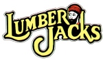 #9. Beardy Guy – Cleveland Lumberjacks (1992)
We’re all a bunch of hypocrites in Cleveland. In 1995, we cried bloody murder when Art Modell yoinked the Browns from the lakefront, and yet just a few years earlier, nobody seemed to mind when our fair city pilfered the Lumberjacks—the IHL hockey club once known as the heart and soul of Muskegon, Michigan. And unlike the good people of Baltimore, we didn’t even bother with a name or logo change (at first). We just rubbed the Muskegonites’ noses in it, parading Paul Bunyan’s lazy-eyed brother around the rink like he was our own. It was a dark time, but fortunately, we came to our senses…
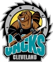 #8. Angry Beaver in Overalls – Cleveland Lumberjacks (Late ‘90s)
… which leads us to this monstrosity. After a couple years, the Cleveland Lumberjacks marketing team was faced with a conundrum. How do we create a more uniquely Cleveland brand without sacrificing the great legacy of the Lumberjacks franchise (all 9 years of it)? What they came up with was a new teal and black color scheme (popularized by every single expansion team in every sport in the 1990s), a totally hip nickname ("the Jacks"), and a new logo— naturally, an angry beaver dressed in overalls. You see, “Buzz” the Beaver was still a lumberjack, cuz he chopped down wood... with his teeth. And unlike the beardy man, he was a giant beaver—which offered up no potential for humor or ridicule whatsoever.
![]() #7. The Brownie – Cleveland Browns (1946-1969)
#7. The Brownie – Cleveland Browns (1946-1969)
Now hold it. I know what you’re thinking. The Brownie is awesome. He represents the glory days of Otto Graham and Jim Brown. He’s classic. He’s iconic. He’s even fairly well drawn. All true. But try to be objective for a minute. Imagine that you’re not familiar with the grand history of the Cleveland Browns. Suppose all you know is that there’s this team that plays the violent, dog-eat-dog sport of professional football in the tough, blue collar town of Cleveland, Ohio. Now imagine someone tells you this is that team’s logo. See what I mean? While a brownie may indeed be brown, that doesn’t seem like reason enough to cast a spritely fairy-elf as your answer to the league’s various bears, lions, and Vikings.
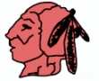 #6. Melted Indian Head – Cleveland Indians (1928)
George Burns led the 1928 Indians in homeruns with 5, which would be okay if not for the fact that the deadball era was over. Maybe that’s why Cleveland ditched this weird-ass logo after one year. On the bright side, this lil’ Indian wasn’t remotely as offensive as future Wahoos. On the downside, he looked like he was fashioned out of play-doh. Or had just sneaked a glance at the Ark of the Covenant. Or, you know how animal crackers are supposed to look like certain animals, but they usually just look like mutated hybrid species or science experiments gone wrong? That’s what this logo is. It's an animal cracker version of an Indians logo.
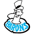 #5. Monocle Guy – Cleveland Barons (1937-1973)
Predating the ill-fated Barons of the NHL, the original Cleveland Barons of the minor league AHL were a successful and noble franchise, in spite of their terrible, terrible logo. Looking like a cross between a James Thurber cartoon and an erect penis with a hat on, Mr. Baron was the face of the franchise for decades. Much like the Brownie, there seems to be a clear disconnect in having an ice hockey squad represented by a snooty, upper crust prick. But there he was, another Cleveland logo to admire nostalgically and irrationally. It should also be noted that the Barons’ NHL logo sucked, too. It seems cool at first, but look again. The letter "C" is edgeless and more akin to a dead worm, while the Old English font on the letter “B” looks more like an “R” on both a first and second glance. This is why hockey died in Cleveland. Wait, we still have a team? The Lake Erie whats?
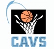 #4. Splashy Basket Hoop – Cleveland Cavs (mid ‘90s)
This one might be a little unfair. In 1994, the Cavs were leaving Richfield behind and moving downtown. Bright lights, big city. Time to update their awesome but admittedly childish V-basket logo and get a little more sophisticated. So they called in a clearly professional graphic designer, came up with a new black and teal-ish blue color scheme (popularized by every single expansion team in every sport in the 1990s), and wound up with this… thing. Kind of transplants you back to that sterile, pajama-blue Gund Arena of yesteryear, doesn’t it? Mike Fratello racing up and down the sidelines while Hill, Mills, and Phills eek out another 71-67 triumph in those hideous paint-splashed uniforms. Yeah, I hate this logo.
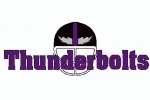 #3. I Know it’s Arena League, But Really? – Cleveland Thunderbolts (1991-1994)
I need to believe that Cleveland’s original Arena League Football franchise-- the transplanted Columbus team known as the Thunderbolts—had a “real” logo. I need to believe that this wasn’t it. It can’t be. No matter how cheap the AFL was or how mismanaged the Bolts might have been, there must be a legitimate Thor-style mascot logo floating around somewhere, right? This cannot be it. A pixilated helmet with Microsoft WordArt “Thunderbolts” typed over top? This was never actually used in any real marketing materials was it? Thunderbolts fans, care to chime in? Your 16 years of silence can end now.
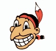
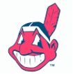 #2. Modern Day Wahoo – Cleveland Indians (1951-Present)
As with the Brownie, there’s no need to get all up-in-arms about this, people (though I know it’s inevitable based on reactions to the recent Tribe uniform changes). We all have a special bond with the Chief. When I was kid, I wore his smiling mug with pride in a state of culturally-unaware bliss. I didn’t even realize Wahoo was supposed to be human, let alone a Native American. He was equivalent to Slider—a silly mascot completely unrelated to the team’s actual name. But of course, in reality, he is an Indian, and he is a relic from the same era when Little Black Sambo and Charlie Chan were considered delightful entertainment. The Chief is to Cleveland as the Confederate flag is to South Carolina (kind of). We’re not necessarily beaming with pride about everything associated with the thing, but it’s part of our history, etc etc. That said, the Cleveland Indians existed long before Chief Wahoo came along (see the melted Indian from #6) and they will go on long after he is finally booted from the last Tribe cap once and for all (I’m guessing this will happen by 2030). Hopefully by then we’ll also realize that our allegiance to the Chief is really just a pining for our own youth, and that a smiling red cartoon isn’t really a vital component to our baseball team’s success or our enjoyment of the same (and hey, modern Wahoo has brought us exactly zero world championships anyway, so maybe he’s not so deserving of our devotion). Keep in mind, this isn’t about being annoyingly PC or forgetting one’s history. Basically, it’s just about doing what the Browns did 40 years ago. They stopped using that stupid Brownie as their main logo-- not because it was offensive to short people and not because they wanted to forget their ‘50s glory days—but because it was stupid.
FUN FACT: A form of Chief Wahoo has only been featured on the Indians cap during 32 of the franchise's 110 years (1951-57 and 1986-Present)
 #1. Yellow Wahoo – Cleveland Indians (1946-1950)
Now, as for all you non-Clevelanders and PC police who complain about Chief Wahoo and how offensive he is and how we haven’t evolved… well consider this, you ignorant bastards. The modern Chief is totally an improvement over the one we won the World Series with back in ’48! Just look at this grotesque grinning idiot right here. You could try with all your might to outdo this and you’d never get there, Man. I’m only 1/16 Cherokee but this hurts at least ¼ of my feelings. That’s a logo transcending its marketing-based origins and becoming true art right before our eyes. Long live Yellow Wahoo!

- NBA Announces 2013-2014 Schedule
- Browns Ink Sharknado
- Sharknado A No-Show For Rookie Camp
- Trent Richardson Out Until Training Camp
- Browns Sign Brandon Jackson
- Carrasco Suspended Eight Games
- Browns Add to Wide Receiver Depth with David Nelson
- Browns Need to Learn from Past Draft Mistakes
- Browns Release Chris Gocong and Usama Young
- Browns Missing on Grimes Disappointing, But Not The End
The TCF Forums
- Movies coming out
rebelwithoutaclue (Tuesday, January 21 2014 12:56 PM) - 2015 Recruiting
jclvd_23 (Tuesday, January 21 2014 12:38 PM) - The 2014 Offseason Thread
Larvell Blanks (Tuesday, January 21 2014 12:25 PM) - Official- Browns Coach Search/Rumors
Larvell Blanks (Tuesday, January 21 2014 11:53 AM) - Chris Grant's first 3 drafts
Kingpin74 (Tuesday, January 21 2014 10:13 AM) - Mike Brown
YahooFanChicago (Monday, January 20 2014 11:15 PM) - 2014 Hoops Hockey Hijinx
jpd1224 (Monday, January 20 2014 4:44 PM) - 2014 Recruiting
jclvd_23 (Monday, January 20 2014 2:26 PM) - Wish List - #4 Pick
Hikohadon (Monday, January 20 2014 1:26 PM) - #1 overall pick Anthony Bennett
TouchEmAllTime (Sunday, January 19 2014 1:28 PM)