


 I can remember a golden era in our pop culture, when album covers were considered fine pieces of art and their unveiling was as anticipated as the record contained within.
Honed to perfection in the 1960s and 1970s, the practice gradually deteriorated as cassette tapes replaced LPs, CDs replaced tapes, and then invisible sound files replaced everything. Naturally, as the canvas to work with got smaller, so too did the impact of the album cover.
Sure, they’re still done and some genuine thought goes into them, but since you generally won’t see one bigger than your thumbnail, the album cover clearly ain’t what it used to be.
The same trend holds true for a Cleveland sports dork like myself who eagerly looks forward to the release of each team’s annual media guide and then promptly adds it to his well-organized library that one looks at and wonders just how many imaginary friends this dude had as a kid.
While 90% of each year’s media guide is exactly the same as the previous year’s media guide, the one method by which each edition plants its own unique flag is the cover.
In many ways, it’s like a scaled-down Sports Illustrated cover that captures both the energy of the accomplishments of the year before (if any) and graphically depicts the optimism for the coming season (again, if any).
In general, we’ve seen a bell curve in terms of the creative energy that has gone into the Browns, Indians, and Cavaliers media guide covers over the years: little creativity, followed by a spike in creativity, followed by little creativity.
Until the 1980s, the covers of the Browns’ and Indians’ media guides (also known back in the day as - and how cute is this - “press guides”) were designed in roughly 10 to 15 seconds. Slap an orange helmet or a Chief Wahoo on there, change the year, and call it a day.
The Cavs (and, presumably, the availability of LSD) started to spice things up in the 1970s with some wacky-looking concepts and designs, and by the 1980s, we’d entered the salad days of media guide covers. Basic photography was more or less jettisoned as teams turned to a mysterious coven of people who knew how to draw things.
But as with any golden era, it came to an end too soon. By the mid-1990s, the Cavs were putting a photo of Shawn Kemp eating a Gordita on their media guide cover, the Indians were rotoscoping the Jacobs Field light stanchions for theirs, and the Browns were alternating between making their cover look like the texture of a football (or an unnatural bowel movement) and whitewashing it to resemble the headpiece of a Grand Wizard of the Ku Klux Klan.
While the good times are clearly over, every few years we’ll still see a well-done cover - one that truly does get you fired up about the season to come and/or will help you look back fondly upon the one just past.
In other words, one that does what a good album cover does.
So in the hopes of inspiring our teams’ ever-frantic marketing departments, I present the 10 greatest Cleveland sports media guide covers of all time:
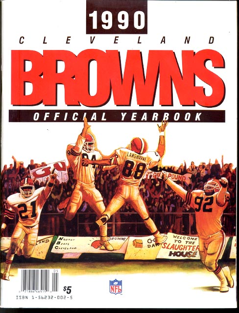 10. 1990 Browns
Like the aging, should-have-already-been-euthanized 1990 Browns themselves, this cover tried to ride the coattails of past glory. And unlike the team, the media guide was actually successful. We see an illustration of Reggie Langhorne and Webster Slaughter airborne about to connect in one of their trademark 1980s high-fives.
If you were lucky enough to get your hands on a 1990 Browns yearbook, you got to see even more of the well-done illustration: with the denizens of the Dawg Pound in the background, wiry Eric Metcalf holds up a finger for every road game the Browns would win that year (yes, just one) and Michael Dean Perry thrusts his arms in the air and throws his head back, either celebrating a big play or worshipping Ra the Sun God.
9. 1992-93 Cavs
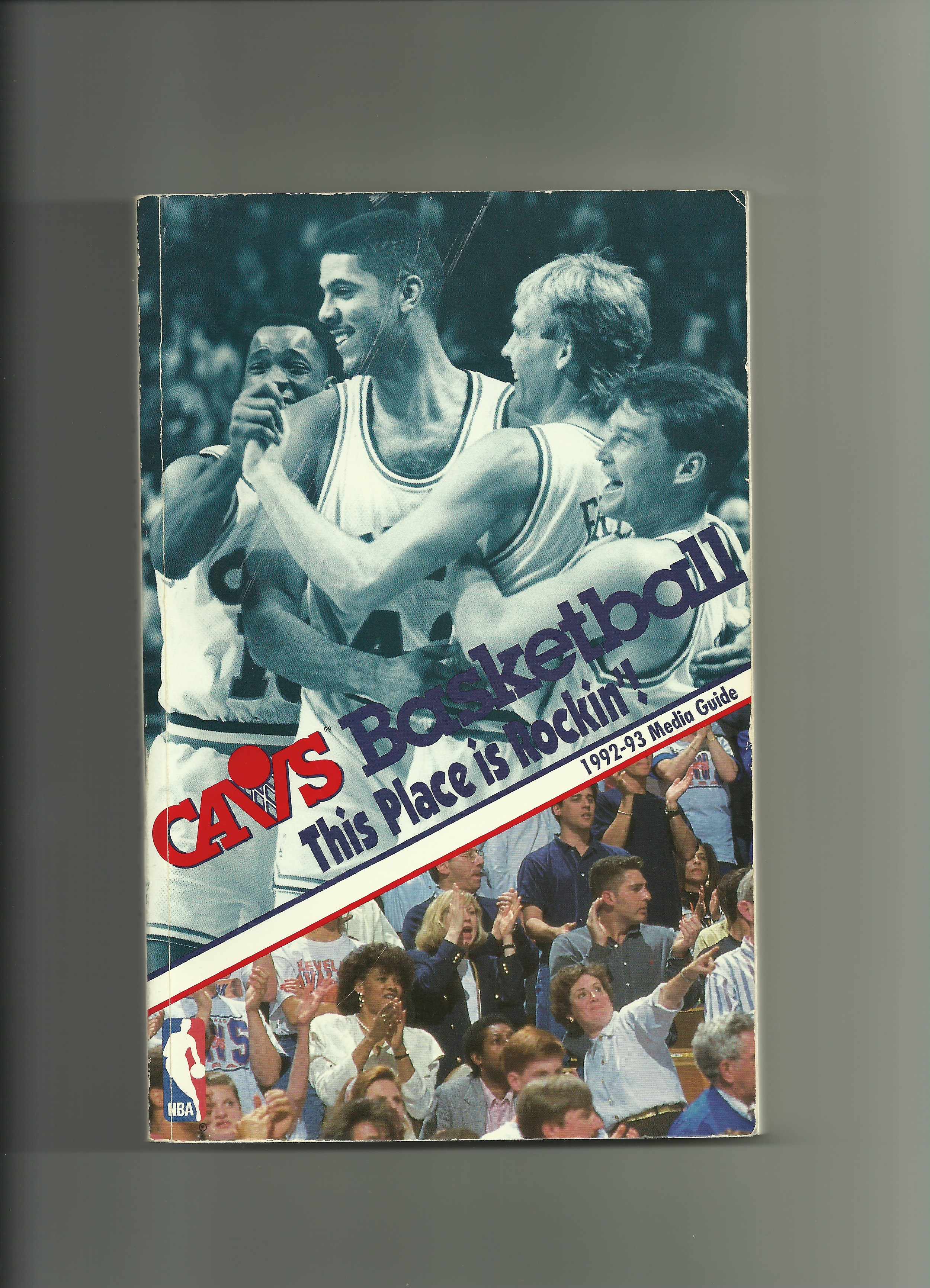 This one was a perfect example of how a winning season can inspire efficient design. After several years of drab, ordinary covers following drab, ordinary seasons, the run to the conference finals by the ’91-’92 Cavs led to an energetic cover layout for the following year’s media guide. The top half showed the Cavs celebrating after Craig Ehlo’s legendary “Yes, Virginia” three-pointer to beat Utah the previous Christmas, and the bottom half showed a Coliseum crowd cheering, presumably while something by Kris Kross played over the sound system.
Yes, they cheapened it a little by slapping the milquetoast “This Place is Rockin’!” slogan in the middle, but it’s still strong enough to win over Steven Tyler and J-Lo and move on to Hollywood.
 8. 2010-11 Cavs
This was perhaps the only time in the history of sports that a media guide politely invited the rest of the world to kiss its ass.
Three months after “The Decision,” the Cavs cranked out a deliciously simple cover design: a close-up of the new, classic, wine-colored road jersey with “Cleveland” stretched across the front in bold gold letters.
Not “Cavaliers,” but “Cleveland.”
Message delivered for pennies on the dollar.
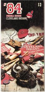 7. 1984 Indians
Smack dab in perhaps the bleakest era in team history, the Indians managed to put together one of their most impressive covers. It was a nostalgic collage of old pennants, jerseys, caps, equipment, and racist bobbleheads that desperately tried to make you understand that the classy, legendary Tribe teams of the past were actually connected to the current polyester-clad train wreck managed by Pat Corrales.
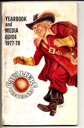 6. 1977-78 Cavs
While memorable, this one was mostly creepy.
Give the Cavs’ front office credit for taking their creativity to another level, deciding to illustrate a full-blown “cavalier,” complete with blonde porn-star beard, pimp feather hat, stiletto boots, and a massive tapered collar, leering at the reader while dribbling a basketball.
Back then, it was innovative and folksy. Today, we look at it and see the Burger King guy.
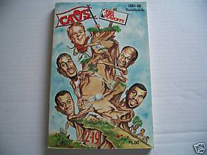 5. 1985-86 Cavs
The Saturday-morning-cartoon feel of this one may have seemed juvenile to some, but considering the landscape, it was the perfect idea at the perfect time. The Cavs were coming off a season in which they’d started 2-19 but then rallied to make the playoffs for the first time in seven years.
The fun ’85-’86 cover demonstrates this. It shows caricatures of coach George Karl (who, as it happened, wouldn’t last the season) and several key Cavs players climbing a hill atop which was planted a sign with the 1985 NBA playoff seal on it. They’d clearly traversed from the 2-19 signpost at the bottom of the hill with the enthusiasm and energy of one of the adventurous Family Circus kids.
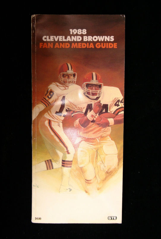 4. 1988 Browns
Similar to the 2010-11 Cavs’ cover, this one also sent a clear message, albeit with considerably more artistic talent.
Six months after Earnest Byner lost The Fumble in the 1987 AFC Championship, he was the cover boy for the ’88 media guide, charging right at the reader with a dogged determination captured perfectly in a brilliant illustration.
Behind him, we see Bernie Kosar, also translated beautifully by hand, having just handed the football off and watching Byner go. It may very well be an illustration of “13 Trap,” the infamous play that would define Byner’s career that fateful January evening in the Rocky Mountains.
If The Fumble were made into a movie, this would be the teaser poster. And the Browns boldly put it on their media guide, which stated three things loud and clear:
a) We’re not going to hide from what happened.
b) Earnest Byner is one of us.
c) You got a problem with that?
This is why we used to love this team.
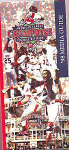 3. 1998 Indians
Those passionate, reflective moments just before the 1998 season began may well have been the most stupidly optimistic of the Jacobs Field era. Coming off their second World Series appearance in three years, we thought the Indians genuinely appeared to be something of a dynasty. Then they started the season with Shawon Dunston at second and Geronimo Berroa in left and the Yankees won 114 games.
But this boundless pride and hope is reflected in the ’98 media guide cover: a marvelous collage of celebratory images and "titletown" logo laid over the main entrance to the Jake as if it were the threshold of Camelot.
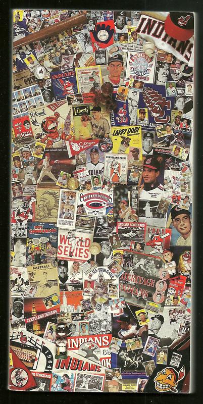 2. 1993 Indians
This was the Sgt. Pepper’s Lonely Hearts Club Band of Cleveland media guides.
The 1993 campaign was a final farewell for baseball at Cleveland Stadium. To commemorate it, and reflect upon the 60-plus years the Tribe had spent there, the team put together a wildly elaborate collage of photographs, pennants, programs, magazine covers, baseball cards, and other various hot nonsense to create the most intricate media guide cover in Cleveland sports history.
Every time you look at it, you see something new.
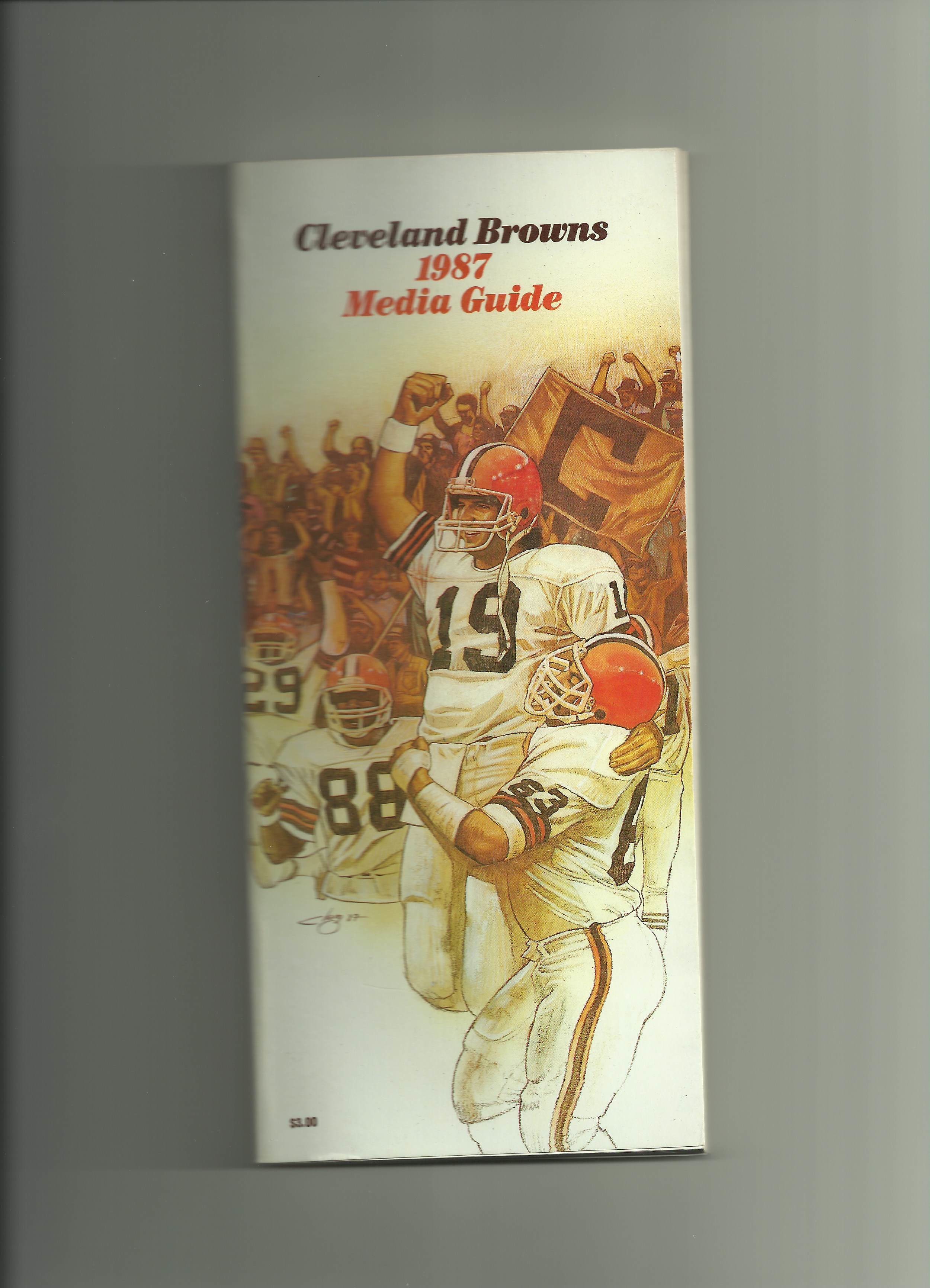 1. 1987 Browns
This was the Abbey Road of Cleveland media guides.
The rhapsodic 1986 Browns’ season is perfectly captured with a wonderful composite illustration of the many we saw on the field that year. Bernie Kosar is being lifted into the air by Cody Risien, Hanford Dixon and Reggie Langhorne are rushing to join the fun, and in the background, the Dawg Pound - with actual fans’ faces - revels.
This is the gold standard - the media guide cover by which all other media guide covers will be judged.
For the busy front office staff of a professional sports team, I know what goes on the media guide cover ranks right up there in importance with what brand of paper towels to use in the stadium restrooms, but I hope the significance and - dare I say it - magic of this process is never lost or digitized into oblivion.
Some books should be judged by their covers.

- NBA Announces 2013-2014 Schedule
- Browns Ink Sharknado
- Sharknado A No-Show For Rookie Camp
- Trent Richardson Out Until Training Camp
- Browns Sign Brandon Jackson
- Carrasco Suspended Eight Games
- Browns Add to Wide Receiver Depth with David Nelson
- Browns Need to Learn from Past Draft Mistakes
- Browns Release Chris Gocong and Usama Young
- Browns Missing on Grimes Disappointing, But Not The End
The TCF Forums
- Official- Browns Coach Search/Rumors
HoodooMan (Tuesday, January 21 2014 1:32 PM) - Movies coming out
rebelwithoutaclue (Tuesday, January 21 2014 12:56 PM) - 2015 Recruiting
jclvd_23 (Tuesday, January 21 2014 12:38 PM) - The 2014 Offseason Thread
Larvell Blanks (Tuesday, January 21 2014 12:25 PM) - Chris Grant's first 3 drafts
Kingpin74 (Tuesday, January 21 2014 10:13 AM) - Mike Brown
YahooFanChicago (Monday, January 20 2014 11:15 PM) - 2014 Hoops Hockey Hijinx
jpd1224 (Monday, January 20 2014 4:44 PM) - 2014 Recruiting
jclvd_23 (Monday, January 20 2014 2:26 PM) - Wish List - #4 Pick
Hikohadon (Monday, January 20 2014 1:26 PM) - #1 overall pick Anthony Bennett
TouchEmAllTime (Sunday, January 19 2014 1:28 PM)